In preparation for our upcoming move to Tulsa, we’ve spent the last couple of months getting our house ready to sell. If you’ve watched HGTV shows like Designed to Sell, you’ve probably heard the term “staging” thrown around. Staging is all about making your home appear larger, cleaner, more inviting, and ultimately more appealing to potential buyers.
Our master bathroom is a great example of how a space can be dramatically transformed with a little paint, new flooring, and a few well-placed accessories. The three photos below tell the story of our bathroom makeover.
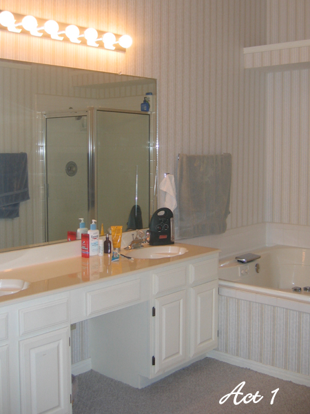
Yes. Yes, that is carpet in the bathroom.
Don’t judge…we didn’t even own the place at this point. The photo was taken during our inspection in 2006, weeks before we closed on the house. I’m not kidding when I tell you that the very first thing we did when the keys were handed over was rip out that dreadful, sour-smelling carpet.
And then there was the wallpaper. Layers and layers of wallpaper! Fortunately we were still enthusiastic about our freshly sealed status as homeowners and patiently peeled away confetti-sized bits of wallpaper (and sheetrock) for days on end until our fingers were bloody nubs the job was complete.
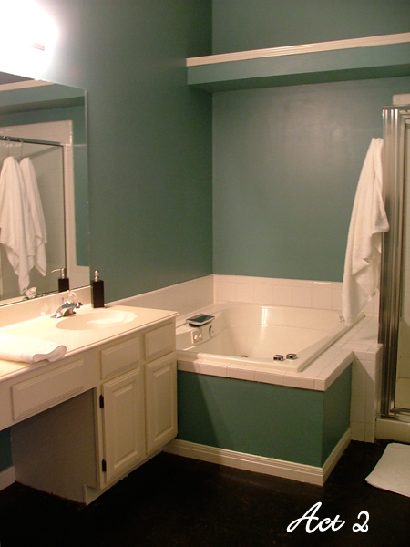
Anxious to splash some color on the walls, we headed to Home Depot determined to create a peaceful, spa-like atmosphere in our master bathroom. After carefully analyzing various shades of turquoise, teal, and aqua, we finally crowned Ralph Lauren’s “Emperor” the winner.
For an affordable and easy-to-maintain flooring solution, we elected to stain the concrete slab. We chose a black stain to create a crisp contrast against the clean, white cabinetry. Staining the floor dramatically changed the overall vibe of the space and was worth every penny!
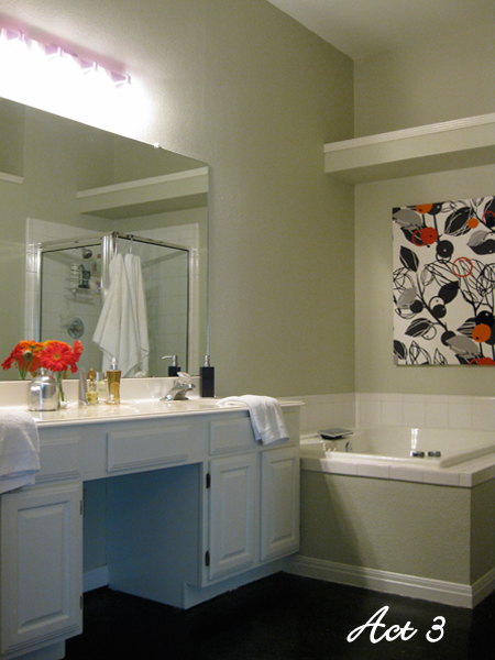
As much as we liked the color scheme of our spa retreat, we knew that palette wasn’t for everyone. Before putting the house on the market last month we had the master bathroom walls textured and repainted with a neutral paint color (Ancient Marble by Sherwin Williams).
To take the neutralized space from “blah” to “Ah!”, I created artwork by simply covering a blank canvas with a couple yards of bold, graphic fabric from Ikea. This solution is not only inexpensive and easy to repurpose for our next house, but it will also hold up well in a moist environment.
The outdated broadway vanity lights were replaced with a contemporary brushed nickel fixture from Lowe’s. The combination of new lighting and paint really brightened up the space, making it appear much larger than before.
To put a finishing touch on the master bathroom transformation, bottles of perfume and cologne were displayed on a lucite tray on the counter next to a cluster of cheerful Gerbera Daisies. The orange flowers were chosen to emphasize the accent colors in the artwork.
We think the space is so much more inviting than we found it 4 years ago. It actually feels like a retreat now! Apparently potential homebuyers thought so, too. Over a period of just 5 days we had 20 showings, lots of positive feedback on the house, and accepted an offer. The thought of selling our first home and moving out-of-state in less than 2 weeks makes me feel a little sappy. There’s nothing a long bubble bath won’t cure, though!


2 Trackbacks
[…] a previous blog post, I wrote all about our original master bathroom makeover and then how we later staged the space […]
[…] the saga of the master bathroom! You can read all about its complete transformation here. We first painted the space a teal shade in hopes of creating a spa-like retreat. Then, before […]
3 Comments