I spent the weekend with Frank Lloyd Wright.
Um, I should probably clarify that statement. I didn’t actually see him (he’s dead, you know), but rather spent the night inside the architectural masterpiece he designed in downtown Bartlesville, Oklahoma.
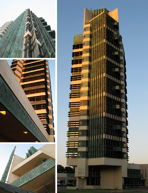
The 19-story Price Tower, Wright’s tallest constructed project, was completed in 1956 when the architect was 89 years old. Originally built as headquarters for the H.C. Price Company, the skyscraper now houses a museum, boutique hotel, and bar with gorgeous panoramic views of the Osage Hills. We studied this building in my architecture history classes in college but, after seeing it firsthand, I now have a much better understanding of the design principles Wright used here.
The Tree That Escaped the Crowded Forest
Wright borrowed the structural concepts for the Price Tower straight from nature. His skyscraper is built like a tree, with a “taproot” foundation and a central “trunk” that supports the cantilevered floors or “branches”. The patinated copper cladding decorating the facade even gives the effect of green leaves.
Wright described his skyscraper as the “the tree that escaped the crowded forest” because he originally conceived the design for a residential complex in New York City, but the project never came to fruition. When the Price family approached him about designing offices for their growing pipeline company in Oklahoma, Wright showed them his shelved drawings for St. Marks-in-the-Bouwerie. As the story goes, the Prices loved the design and asked the architect to adapt his concept to fit their project. That’s how Wright’s “tree” was plucked out of the “crowded forest” of NYC skyscrapers and became part of the Oklahoma landscape.
Pinwheel on the Prairie
The Price Tower has also been compared to a pinwheel because of its abstract shape. The odd floor plan is based on a complex grid of primary forms rotated around a central axis to create quadrants. Wright was so obsessed with the geometric composition of the spaces that he even designed custom furnishings to align with the diagonal grid of the floor plan.
Not only does the tower’s pinwheel configuration create interesting interior and exterior spaces, but it also maximizes views of the prairie landscape and allows each facade to individually respond to sun and wind exposure. Vertical fins identify the quadrant of the building that originally consisted of apartments while horizontal louvers distinguish the office areas.
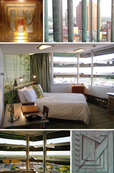
We had a great view of downtown Bartlesville and the surrounding landscape from our hotel room on the 12th floor. It was originally one of the offices; architect Wendy Evans Joseph reinterpreted the interior to complement Wright’s aesthetic, yet distinguish the new elements from the original. I thought it was a great adaptive reuse of the space, but I can’t help but wonder what Frank Lloyd Wright would think about the changes.
I bet he would be annoyed that the placement of the flat screen TV doesn’t align with his geometric grid. But I also think Wright would be pleased that the Price Tower remains as architecturally significant today as it was when the skyscraper opened in 1956.

