I recently got this text from my dear friend Bethany:
I am knee deep in Pinterest trying to pick tile for our bathroom remodels. Can I pay you to pick them for us? 😉 Or better yet, I’ll buy your flight out here for a consultation and get friend time, too!
Oh how I wish I could drop everything and fly to Austin to help my friend in her time of need! Since life and work stood in the way of making that a reality, we did the next best thing – a virtual mood board! Bethany already had a good start, she just wanted help pulling it all together in order to visualize the finished product and communicate her ideas to the contractor.
We started with the guest bathroom since the contractor is scheduled to tackle that one first. In addition to serving guests, it is also shared by her 9-month-old daughter and 4-year-old son. With that in mind, these are the main goals for the project:
- Resale Value – Choose neutral finishes that will coordinate with the rest of the house and provide the biggest bang for their buck.
- Fun & Functional – Select decorative elements that will work for kids and guests alike. The space should be kid-friendly, but not overly cutesy or thematic.
- Gender Neutral – Pick a color scheme that fits both girls and boys while also incorporating the dark wood finish that is used throughout the house.
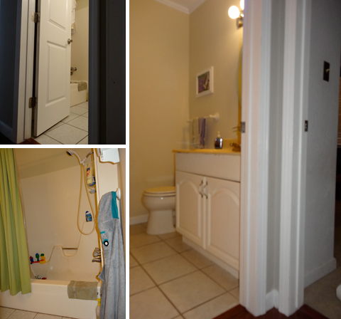
Here’s Bethany’s guest bathroom as it looks today:
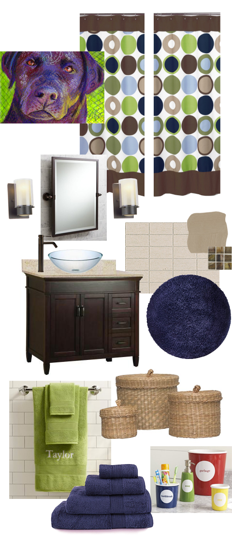
And here is the mood board bringing together our ideas for her upcoming remodeling project:
Sources: Shower Curtain, Dog Artwork, Mirror, Lighting, Faucet,
Vessel Sink, Vanity, Paint, Subway Tile, Accent Tile, Bath Mat,
Countertop Accessories, Seagrass Baskets, Towels
For the base color palette (tile, countertop, paint) I choose warm earth tones (tans & chocolate brown) both for resale value and to flow with existing decor throughout the rest of their home. These neutral colors also help to keep the space from becoming too masculine or feminine. Bright splashes of color can be brought in with a few punchy accessories, like the shower curtain and artwork. This enables Bethany to easily update the decor as her kiddos grow.
I fell in love with this original labrador retriever drawing that I came across on Etsy because it reminds me of Stella, their beloved chocolate lab, and also because it incorporates the lime green and navy blue accent colors I chose for the space. The actual size is only 2.5″ x 3.5″, but with the artist’s permission Bethany could scan the original and have it printed on a larger canvas using a service like Canvas People. Or, the original would also look sharp in a large gallery frame with an oversized white mat.
There are few tricks Bethany can employ to make this small bathroom appear larger. I recommend purchasing two shower curtains (or cutting one curtain in half) and hanging it on both sides of the tub at ceiling height (like this and this) so that the bottom of the curtain barely brushes the floor. Not only will this make the room appear taller, but it also lends a more tailored, custom look overall. The orientation of the rectangular subway tiles in the shower also affects how large the room appears. Laying them vertically (portrait) will make the space seem taller while orienting them horizontally (landscape) will appear wider. There’s really no right or wrong way, it just depends on personal preference.
So there it is, our mood board for the kid-friendly guest bathroom makeover. I’d love to know what you guys think. Any last-minute advice for Bethany before the contractor begins?


No Trackbacks
2 Comments