Minding My Business

Any graphic designer will tell you that its incredibly difficult to design marketing materials for their own business. It’s easy to get so busy creating gorgeous collateral for clients that they don’t have the time or energy left to promote themselves. I have found this to be true for my freelance business too. Combine that with a case of hardcore perfectionism and I have the world’s worst client: ME!

Case in point: business cards. I have been completely out of them for longer than I care to admit! I know. What kind of graphic designer doesn’t have business cards?

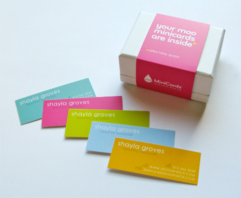
Fortunately, that just changed; my new moo minicards arrived this week! Have you heard of moo? They are a great online printing company that allows you to print up to 100 different designs in each run. Best of all, it’s really cost-effective! For example, 100 double-sided minicards cost around $20. Standard business cards will only set you back about $45 for 100. You can feel good knowing they print on high-quality, sustainably-sourced paper.


Design Finch Business Cards

I’m really happy to have business cards again. And they happen to be pretty darn cute, if I say so myself! Needing business cards of your own? Let me know, I’d love to custom design something for you.

Chicago

I just returned from a spontaneous trip to Chicago with my mom. We were chatting on the phone several days ago and the conversation went something like this:

Mom: “We should take a girls’ trip somewhere.”
Me: “Ok, where do you want to go?”
Mom: “Wouldn’t it be fun to take an architectural tour of Chicago!”
Me: “You are speaking my language! When can you get away?”
Mom: “How about this week?”
Me: “I’m buying the tickets now.”

And so, we went! We are just wild and crazy girls like that.


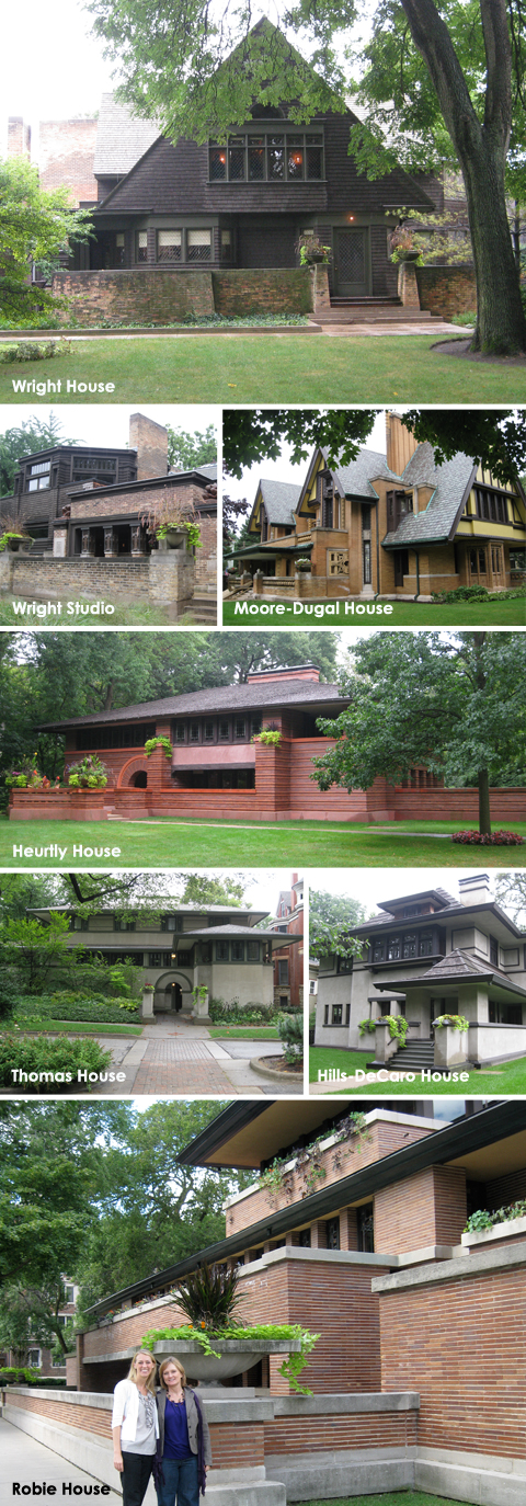
Chicago, Frank Lloyd Wright Homes

Homes designed by Frank Lloyd Wright

The highlight of the trip was touring several structures designed by Frank Lloyd Wright (FLW), including his own home and studio. We went on a guided tour of the FLW Historic District in Oak Park, then explored the Hyde Park neighborhood on our own where we visited one of his most celebrated homes, the Robie House. Walking through the neighborhoods, it was really interesting to see the progression of FLW’s ideas about architecture. While some of FLW’s signature design elements are evident in his earlier homes, the Robie House (1910) exemplifies his Prairie style of architecture in its purest form. The house feels so contemporary that it is hard to imagine it was built 100 years ago. Mom and I agreed that we could move right in and feel perfectly at home there!


University of Chicago

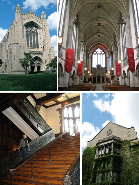
Rockefeller Chapel and Ida Noyes Hall on the University of Chicago campus

We also enjoyed walking around the University of Chicago campus in Hyde Park and peeking inside some of the old Gothic-style buildings. The Rockefeller Chapel, built in 1928, was especially stunning! We were interested to learn that many of the university buildings were built several years after Wright’s Robie House, yet they appear much older. That really put into perspective how progressive FLW’s architecture was for its time.


Art Institute of Chicago

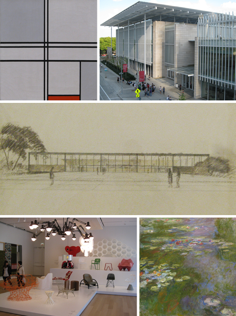
Art Institute of Chicago
Clockwise: Piet Mondrian, Composition No. 1 (1935); Modern Wing; Ludwig Mies van der Rohe, Illinois Institute of Technology: Library and Administration Building Proposal (c. 1944); Claude Monet, Water Lily Pond; Contemporary Furniture exhibit

We spent an afternoon at the Art Institute of Chicago, but could have stayed much longer because there is so much to see there! I particularly enjoyed the exhibits on Impressionism, Contemporary Furniture, and Architectural Drawings. The new Modern Wing, designed by architect Renzo Piano, is an interesting piece of artwork in and of itself.


Millennium Park, Chicago

Millennium Park

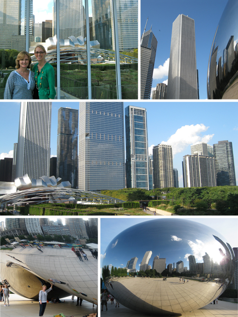
From the Art Institute, we ventured next door to Millennium Park where we had fun taking pictures with The Bean. What a neat place…this is definitely not your average picnic spot! In fact, we enjoyed cocktails and hummus at the little outdoor cafe in the park. I told you we are wild and crazy!

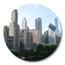
Chicago Skyline
Somewhere between all the walking, we squeezed in a little shopping and even saw a Broadway musical at the Oriental Theatre. Then, we did some more walking for good measure. Although my feet may never be the same, I had a great time with Mom in Chicago and am proud of us for being so spontaneous!

Label Love

I know I’m not the only one who enjoys getting real mail. What’s more fun than opening the mailbox to find a handwritten card or letter poking out from under a pile of boring bills?

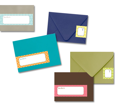
Wrap-around Address Labels

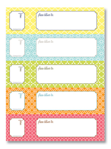
This week I was designing custom address labels for a client’s wedding invitations and was having so much fun that I felt inspired to create another set of wrap-around mailing labels for myself in colorful, geometric patterns. And where’s the joy in making something if you don’t share it, right? So here you go, my friends….a FREE and FABULOUS address label template to add a little spice to your own correspondence. Think of how happy you’ll make someone when they find a sweet note from you in the mailbox!

The labels are formatted to fit size A2, A6, and A7 envelopes. Here is what you need to know to print these babies:

  • Free wrap-around address label templateFirst, download the PDF file and save it to your computer. You will need Adobe Acrobat Reader software to open the PDF. (You probably already have it on your computer, but if not you can download the free software here.)
  • Simply type the mailing and return addresses in the editable text fields.
  • Print the labels and trim on the crop marks. If you don’t have adhesive paper, you can print on regular paper and attach the labels to the envelopes with a glue stick.

Sending a thoughtful note is almost as fun as receiving one, so I challenge you to spread a little sunshine this weekend by writing a quick letter to someone special. Hey, the label is already done for you!

The Price is Wright

I spent the weekend with Frank Lloyd Wright.

Um, I should probably clarify that statement. I didn’t actually see him (he’s dead, you know), but rather spent the night inside the architectural masterpiece he designed in downtown Bartlesville, Oklahoma.

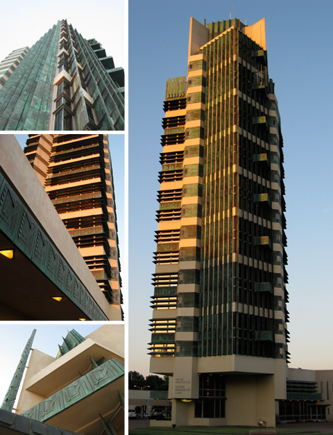
The 19-story Price Tower, Wright’s tallest constructed project, was completed in 1956 when the architect was 89 years old. Originally built as headquarters for the H.C. Price Company, the skyscraper now houses a museum, boutique hotel, and bar with gorgeous panoramic views of the Osage Hills. We studied this building in my architecture history classes in college but, after seeing it firsthand, I now have a much better understanding of the design principles Wright used here.


The Price Tower, Frank Lloyd Wright

The Tree That Escaped the Crowded Forest
Wright borrowed the structural concepts for the Price Tower straight from nature. His skyscraper is built like a tree, with a “taproot” foundation and a central “trunk” that supports the cantilevered floors or “branches”. The patinated copper cladding decorating the facade even gives the effect of green leaves.

Wright described his skyscraper as the “the tree that escaped the crowded forest” because he originally conceived the design for a residential complex in New York City, but the project never came to fruition. When the Price family approached him about designing offices for their growing pipeline company in Oklahoma, Wright showed them his shelved drawings for St. Marks-in-the-Bouwerie. As the story goes, the Prices loved the design and asked the architect to adapt his concept to fit their project. That’s how Wright’s “tree” was plucked out of the “crowded forest” of NYC skyscrapers and became part of the Oklahoma landscape.

Pinwheel on the Prairie
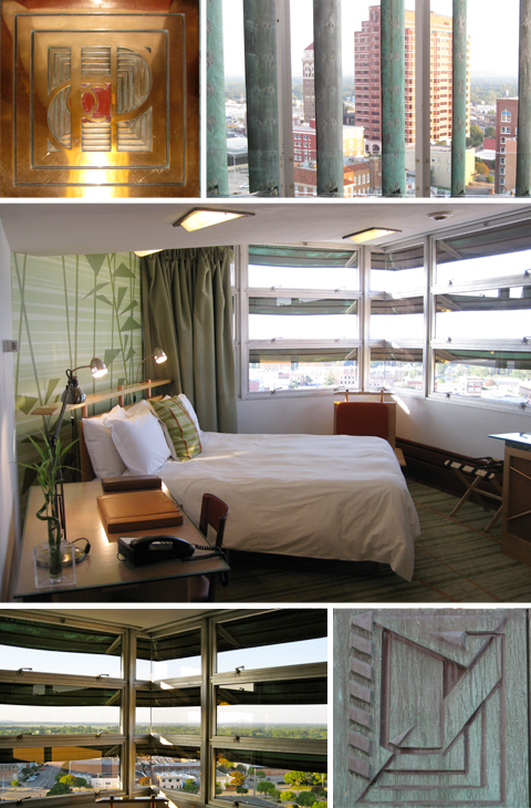
The Price Tower has also been compared to a pinwheel because of its abstract shape. The odd floor plan is based on a complex grid of primary forms rotated around a central axis to create quadrants. Wright was so obsessed with the geometric composition of the spaces that he even designed custom furnishings to align with the diagonal grid of the floor plan.

Not only does the tower’s pinwheel configuration create interesting interior and exterior spaces, but it also maximizes views of the prairie landscape and allows each facade to individually respond to sun and wind exposure. Vertical fins identify the quadrant of the building that originally consisted of apartments while horizontal louvers distinguish the office areas.


Interior, The Price Tower, Frank Lloyd Wright

We had a great view of downtown Bartlesville and the surrounding landscape from our hotel room on the 12th floor. It was originally one of the offices; architect Wendy Evans Joseph reinterpreted the interior to complement Wright’s aesthetic, yet distinguish the new elements from the original. I thought it was a great adaptive reuse of the space, but I can’t help but wonder what Frank Lloyd Wright would think about the changes.

I bet he would be annoyed that the placement of the flat screen TV doesn’t align with his geometric grid. But I also think Wright would be pleased that the Price Tower remains as architecturally significant today as it was when the skyscraper opened in 1956.

Stylish School Supplies

“Don’t you love New York in the fall? It makes me wanna buy school supplies. I would send you a bouquet of newly sharpened pencils if I knew your name and address.”

– Joe Fox (Tom Hanks) in You’ve Got Mail

Well, it doesn’t exactly feel like fall here in Tulsa, Oklahoma but that back to school excitement is definitely in the air. My hubby starts his first year of law school this week! Yesterday we ran into Target and Office Depot to pick up a few supplies he needed and, oh my goodness, there is so much cute stuff out there right now! Unfortunately, I couldn’t convince him to get the elephant-shaped lunch pail….and he even passed on the pastel-colored legal pads. I can’t imagine why!

Buying school supplies is one of my favorite things in the whole wide world. There is something exhilarating about picking out a brand new spiral notebook and a box of sharpened Crayons in 64 glorious colors….it’s a fresh start, a new year full of possibilities. These are my picks for going back to school in style:

Stylish School Supplies

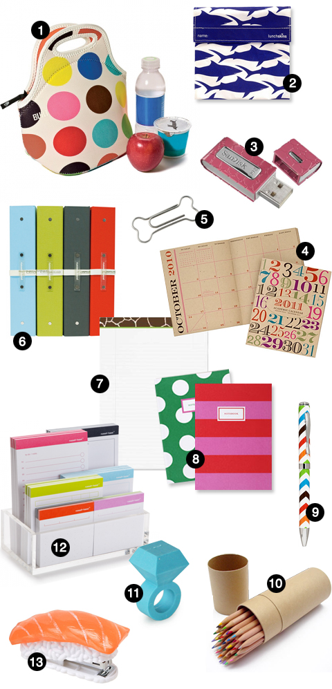
1. Gourmet Getaway Lunch Tote 2. LunchSkins Sandwich Bag
3. ScanDisk Cruzer Gator Flash Drive 4. Paper Source Academic Calendar
5. Bone Paper Clips 6. russell+hazel Three-ring Binder Set 7. Giraffe Legal Pad
8. Sarah Pinto Notebooks 9. Jonathan Adler Chevron Pen 10. MUJI Colored Pencils 11. Eraser Ring 12. russell+hazel Adhesive Note Set 13. Sushi Stapler

Even those of us who aren’t hitting the books again deserve a new pretty or two….you know, just a little something to keep the creative juices flowing! Let me also recommend my all-time favorite school supply, the KinderMat. Remember when taking a nap after lunch was mandatory?

Ah, Kindergarten! Yes, I believe that was the same year I sported a backpack adorned with “real” butterfly wings.

Jewelry Organization Station

Necklace ChaosThis weekend I decided to do something about the chaos inside my jewelry box because all my necklaces were somehow tangled together into one giant ball. (Perhaps it’s a good thing they come from Target, not Tiffany’s!) Anyway, after I spent a sweet forever unraveling them, I decided there had to be a better way. Inspired by some hooks in the junk drawer and an old frame from the garage, I created a jewelry organization station.


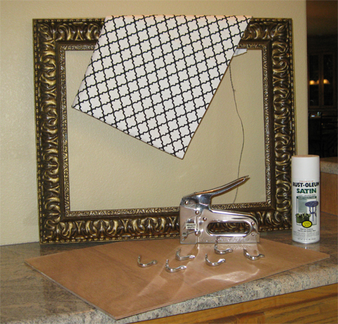
Tools for Necklace Organizer Project These are the supplies I used for this project:

  • Salvaged 16″ x 20″ Frame
  • 1/4″ Plywood, cut to fit frame
  • 1/2 yard Fabric
  • Spray paint
  • 8 Hooks
  • Screws
  • Screwdriver
  • Staple Gun


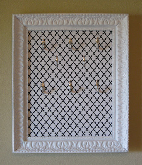
Necklace OrganizerFirst I painted the frame with white spray paint. While the frame was drying outside, I covered the plywood with fabric and secured the overlapping edges on the back side with staples. Then, I poked tiny holes in the fabric to mark where the hooks would go. Since I have quite a few necklaces, I used 8 hooks and spaced them out to accommodate various lengths. The hooks were then attached to the fabric-covered plywood with 1/4″ screws.


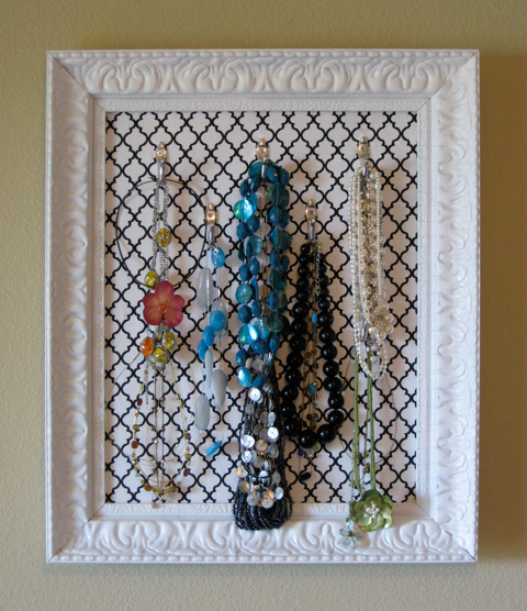
Organized NecklacesVoilà! The finished product looks like a piece of artwork hanging in my closet and even makes getting dressed feel kinda glamorous! Since I already had most of the supplies on hand, the entire project cost less than $10. That makes me one very happy (and organized) frugalista!

Grilling Goodness

GrillIt’s Summertime and the livin’ is easy…
especially when it comes to cooking! It is just too darn hot right now to be slaving over the stove, so most evenings we’ve been firing up the barbecue instead. Usually we just grill fish or chicken, along with whatever fresh veggies we picked up that week at the Farmer’s Market. It makes an easy, yet healthy dinner…and the best part is that very little cleanup is required. Gotta love that!

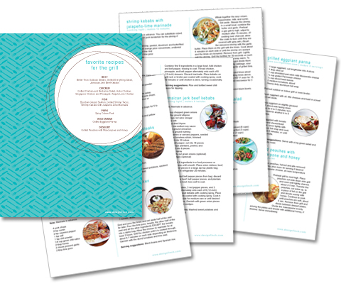
I’m always looking for new dinner ideas to add to my repertoire and was excited to see that Kelly is doing a roundup of favorite grilling recipes on her blog this week. I felt inspired to share our tried and true favorites, so I compiled them into a handy downloadable cookbook.

Favorite Recipes for the Grill

Download our Favorite Recipes for the Grill

I’ve tried countless recipes, but these 13 are guaranteed to be tasty every time! Let me know if you decide to try any of them. Don’t miss the recipe for grilled peaches with mascarpone cheese and honey; it will cause you to question how you ever lived without it. (And while we’re on the subject, I have no idea what mascarpone cheese is exactly…only that it is delicious and it lives on the yogurt aisle, not with the cheeses as its name implies!)

What are your favorite summer recipes?

Corralling Keepsakes

Summer is a terrific time to complete a few organizing projects, especially on those triple-digit days when going outside after 7 a.m. is not even an option. While tackling some clutter this week, I was reminded of my favorite tools for corralling personal keepsakes:

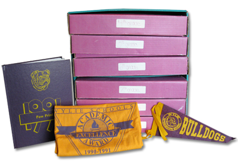
School Keepsake Storage Box

My mom purchased this chest from Lillian Vernon when I was in elementary school to organize my artwork, yearbooks, and other bulky mementos. (Although this product is no longer available, you could use a flat file or follow this tutorial to make your own keepsake box.) I think this is such a great way to organize childhood memorabilia because limiting items to one small box per school year really encourages you to keep only those treasures which are most meaningful.

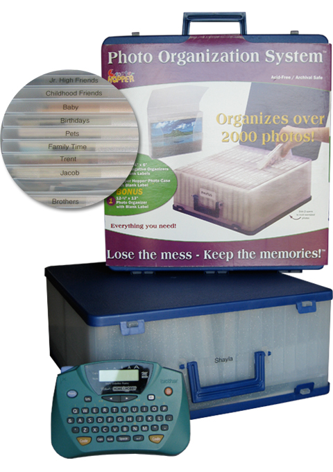
Cropper Hopper Photo Storage We had loose photos floating around all over the house until I discovered the Cropper Hopper. (Ours came from Costco several years ago.) Rather than trying to keep our pictures in chronological order, I now organize them into plastic envelopes by theme. Of course, I love any excuse to use my label maker, so each envelope is clearly labelled to simplify sorting! One side of the box holds 4″x6″ photos while the other compartment stores larger prints, making it easy to wrangle all our photos in one convenient place where we can locate them quickly.

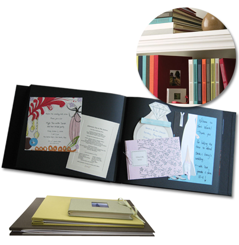
Kolo Scrapbook

Every January, we buy a new Kolo album to hold things like wedding invitations, birth announcements, concert tickets, and favorite photos for that year. It’s essentially a scrapbook, but without the cutesy paper and stickers. I started doing this when I graduated college and have continued the tradition ever since. We enjoy thumbing through the pages and remembering the highlights of each year.


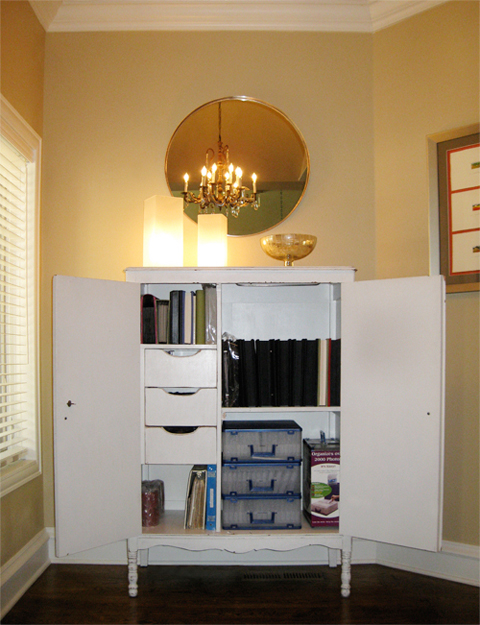
Photo Storage Cabinet

We keep our photos and scrapbooks in a cabinet where they are protected, yet easily accessible so we can enjoy them for years to come. I wish everything was this neat and tidy, but I still have 3 boxes of high school and college memorabilia that I need to cull through and organize in some form or fashion. That is one of my goals for the summer, so I guess I’d better get busy!

How do you corral keepsakes? I need suggestions!

Touring Tulsa

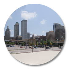
Dowtown Tulsa SkylineOne of the things I’ve come to appreciate most about Tulsa is its rich architectural history. The city has some really fabulous buildings, many of which were built by wealthy oil tycoons in the first half of the 20th Century when Tulsa earned its reputation as “Oil Capital of the World”. The discovery of oil turned many speculators into millionaires overnight, who then set out to create a downtown that reflected the prosperity of the times.


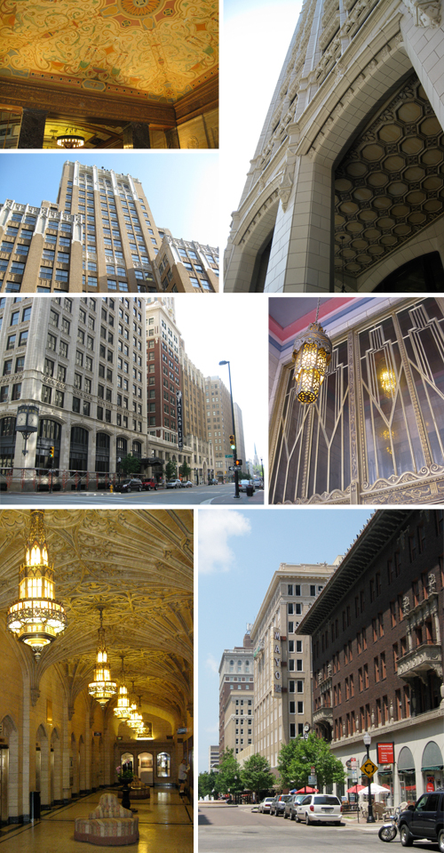
Tulsa Architecture

Some of Tulsa’s first buildings were inspired by the Gothic Revival style that was popular in places like New York and Chicago. During the Roaring Twenties, Tulsans embraced a new flavor of architecture characterized by lavish decoration and futuristic shapes. This modern style, later coined Art Deco, originated in Paris and drew upon an eclectic array of sources for inspiration, including African and Aztec art, King Tut’s tomb, the Machine Age, and principles of aerodynamics. Today Tulsa boasts one of the largest and most well-preserved Art Deco collections in the United States.

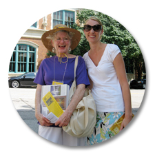
Downtown Walking TourI love learning about architecture (it was my major in college, after all) and totally geeked out when I discovered the Tulsa Historical Society offers guided walking tours of downtown. The tour was really interesting; our friendly guide Sue (pictured with me at left), took us inside several historic buildings to look around and take photos. It would be impossible to compile everything I learned into one blog post, but I think it might be fun to highlight the architecture and history behind a few of my favorite buildings in future posts and link them all here. Stay tuned for those! In the meantime, take the downtown walking tour (usually offered at 10 a.m. on the last Friday of the month) if you find yourself in the area. I promise you’ll learn a few riveting factoids, even if you’re not an architecture nerd like me!

More posts about Tulsa architecture:

Paradise Found

San Jose del CaboSo, I haven’t been this relaxed in a LONG time! We just returned from Los Cabos, Mexico, where we spent the last few days on the beach living the good life. This was our first visit to Mexico’s Baja Peninsula and we chose to stay in the quaint town of San Jose del Cabo at the gorgeous Cabo Azul Resort. The entire trip exceeded our expectations and we’re eager to return to paradise the next chance we get.
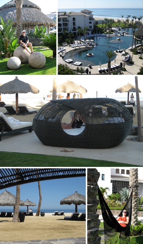

Cabo Azul Resort

We couldn’t have been more pleased with the resort. The property was immaculate and the 360º views of the beach, mountains, and desert were absolutely stunning. Our favorite spot, without a doubt, was inside the bamboo “nest” overlooking the ocean where I finished 3 books between siestas. It was heavenly!
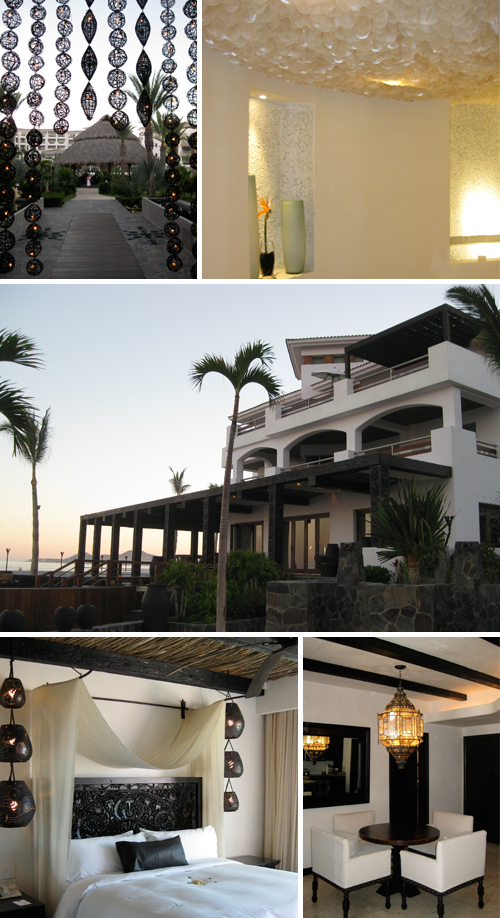

Cabo Azul Resort & Spa

The breezy, romantic decor throughout the resort and spa is the work of interior designer Dodd Mitchell. (Upon visiting his website after returning home, I learned his design portfolio also includes Hotel Valencia where we stayed on our wedding night…so, apparently we’re subconsciously drawn to his style!)

It’s obvious that the designer put a lot of thought into every detail at Cabo Azul – from the thread count of the bed linens, to the luxurious robes in the spa, to the illuminated sculptural elements scattered throughout the public and private spaces of the resort. The result is a sophisticated fusion of color, texture, and lighting (representing earth, wind, and fire) which evokes a sense of harmony. Mitchell is a master at turning spaces into sensory experiences!
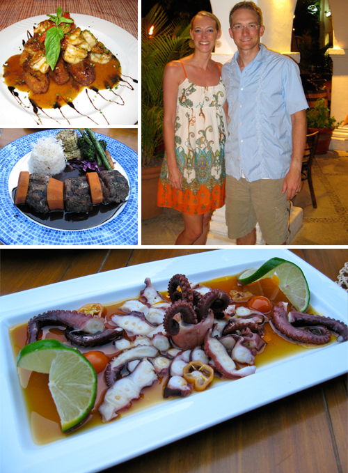

Dining in San Jose del Cabo

Our taste buds were not disappointed by the Baja either! We cooked breakfast and lunch in our villa, then walked the short distance into San Jose del Cabo for dinner. The most memorable meals were at Habanero’s and Mesón del Angel where we dined on amazingly fresh seafood that was almost too pretty to eat.
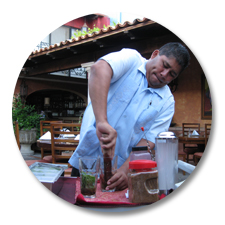
Blueberry Mojito at Mesón del AngelSo, how about a recipe as a little souvenir for those still reading?! At Mesón del Angel, our new buddy Alberto shared his signature Blueberry Mojito recipe with us. His refreshing version calls for several sprigs of fresh basil, about 1/4 cup of frozen blueberries, juice from 1 lemon, 2 tbsp raw sugar, ice, 6 oz. of vodka, and sparkling water. You’ll also need a cocktail shaker and a muddler.

Mash together the basil, blueberries, lemon juice, and sugar until you work up a nice sweat (see Alberto above). Then, add the mixture to a cocktail shaker with ice and vodka. Shake well and serve the mojito in a highball glass, topped off with sparkling water.

Finally – close your eyes, sip slowly, and dream of paradise!

Related Posts Plugin for WordPress, Blogger...