We bought our first home on June 9, 2006, two days shy of our 1-year wedding anniversary. The cozy 1,534 square foot house, which we loving called “Chaz Schraz” (because it’s on Charles Schreiner Trail), was located in the Legend Oaks neighborhood in southwest Austin, about 15 minutes from downtown. Last month we sold our house and relocated to Tulsa to begin an exciting new chapter in our lives, but a part of us will always remain in Austin with “Chaz Schraz”.
Over the course of 4 years that little home in Austin underwent quite a transformation. As I reminisced through the photos we took the very first time we toured the house with our realtor, I realized just how much had changed between May 2006–May 2010. And, while looking back, I also thought it would be fun to round up a few before and after photos to share and document our journey as first-time homeowners.
So, welcome to our nest…..
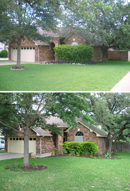
The yard and large corner lot were what initially attracted us to this house. We loved the big, mature live oak trees surrounding the property and saw a lot of potential for enhancing the home’s curb appeal. Shortly after closing, we quickly went to work sprucing up the flowerbeds. Over time, we extended the front flowerbed around the side of the house and added a few native and tropical plants each season. A fresh coat of paint on the trim really brightened up the exterior too.
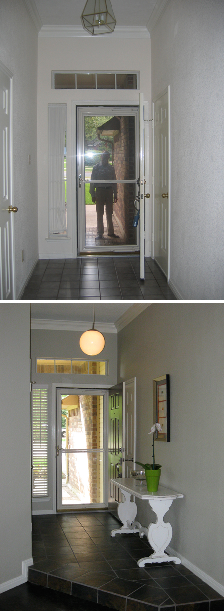
Upon our first look inside, we realized the house was even more outdated than the original MLS photos suggested–with its brass fixtures and yucky tile. Yet, we were able to see past all of that and visualize the true potential. It’s really amazing what we accomplished with paint alone; simply painting the boring, beige walls a cool gray color gave emphasis to the crown moulding and visually heightened the entry area. The old lighting was ousted in favor of a sleeker pendant fixture from Ikea and the brass door knobs throughout the house were also replaced with modern nickel hardware. Certainly the biggest project in the entry was taking up the old flooring and laying new slate tile. This overhaul dramatically improved things aesthetically and proved to be a good investment when it came time for us to sell.
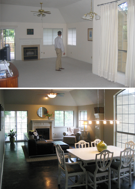
As you enter the front door, this is the view past the dining area and into the living room. When we bought the house everything was beige and boring, a blank slate so to speak. The berber carpet was fairly new, but we knew it would be a nightmare to keep clean with our shedding pets, so we opted to pull it all up and stain the concrete floors underneath. It was by far the best decision we made! Before we moved our furniture into the house, we did all the prep work on the floors ourselves and hired a company to apply the black stain and clear sealer. We were really pleased by how the stained concrete reflected light, making the space appear much larger than before when it was covered by carpet.
We carried the same paint from the entry into the dining area/living room and extended the wall color up the vaulted part of the ceiling to visually heighten the space. In the before photo, you can see where the wall color stops at the base of the ceiling and essentially chops the height of the room in half.
Again, the brass light fixture and ceiling fan were updated with more contemporary and energy-efficient ones. We also chose to remove the window treatments for a cleaner look and to allow the natural light to flood the space.
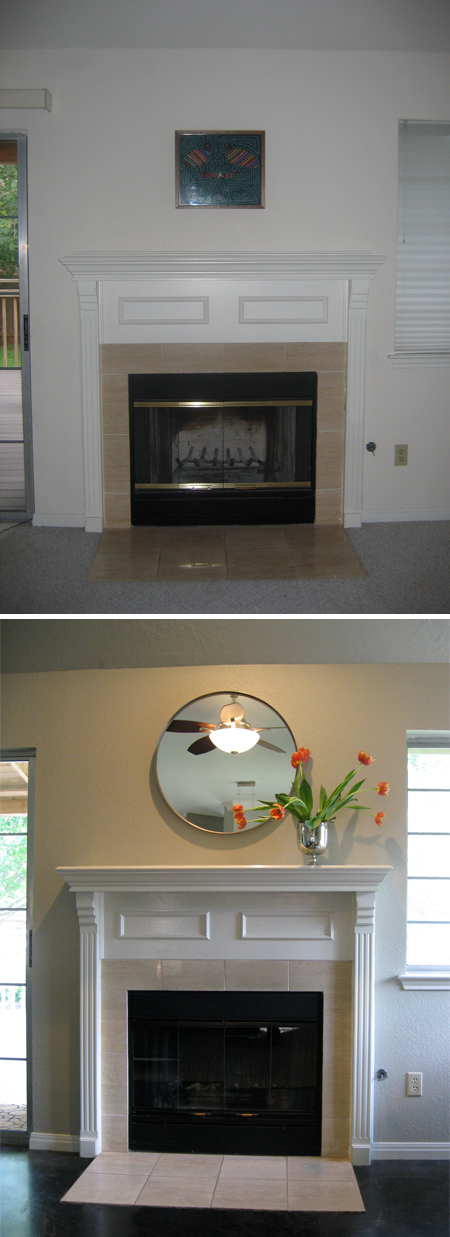
The easiest fix was the fire place. In less than 5 minutes, with a can of heat resistant grill paint, the brass was gone and the smoke stains were cleverly disguised!
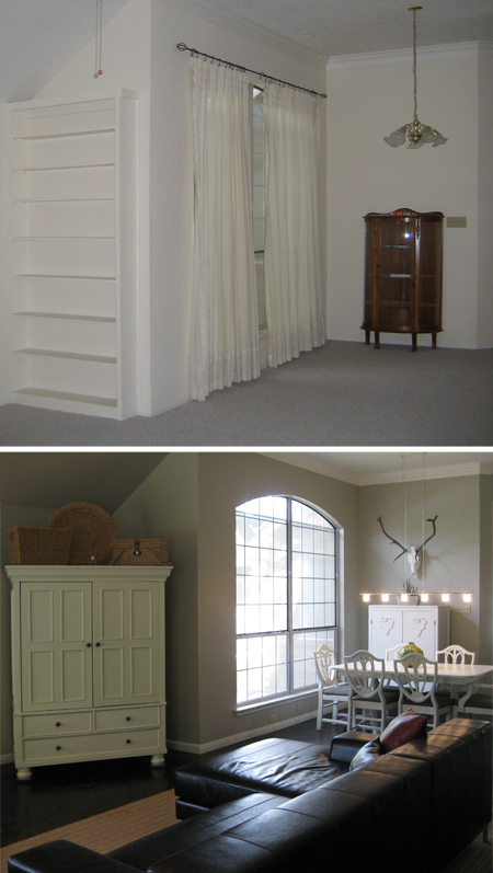
This is the view from the living room looking back towards the dining area. You can see in the before photo that there was once an awkward built-in bookshelf on the wall where we later placed the TV cabinet. The shelves really weren’t deep enough to hold much, so we removed the bookshelf to make the space more functional.
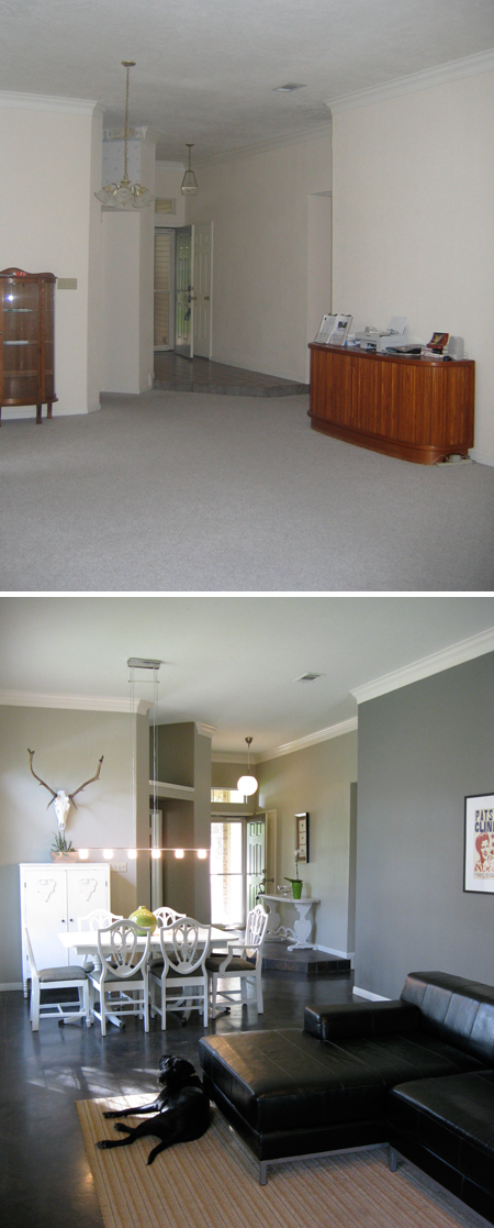
Here’s the view from the living room looking back towards the front door. (Say hello to Denver!) In this photo you can really see the definition between the gray walls and white crown moulding and what a big difference paint can make. We accented the wall on the right with a darker shade of gray, Valspar’s Rugged Suede to be exact. The double doors on the left lead to the kitchen, which we painted a shade of brownish-gray called Stone Manor, also a Valspar color. I really like how the subtle contrast between paint colors creates a seamless transition between rooms.
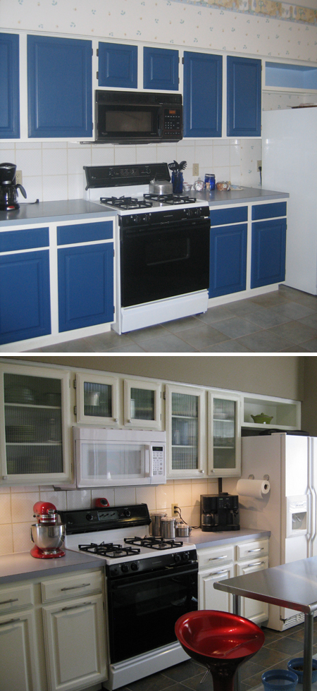
I know, it looks like a Smurf exploded in here! I have no idea why the previous owner thought it was a good idea to paint those cabinets blue…or why we even bought this house after seeing the kitchen! Looking at the before photo still makes me feel a little nauseated. Trust me, it actually looked worse in person if that is even possible.
Before we moved in, we removed the cabinet doors, stripped the old paint off, and gave them several coats of primer and fresh white paint. We replaced the center panel of the upper cabinet doors with panes of reeded glass and added new knobs and pulls for a modern effect. We also installed lighting under the cabinets to better illuminate the work surface.
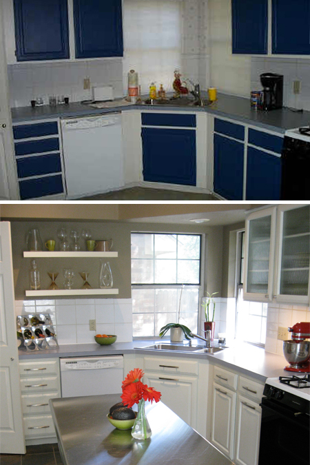
On another wall, we took down a section of cabinets and installed floating shelves in their place to open up the work space around the sink because it felt a little claustrophobic in that corner with cabinets on both sides. We planned to eventually update the backsplash with glass tiles and replace the countertops with either honed black granite or white carrera marble, but decided we likely wouldn’t see a sufficient return, given the comps in our area.
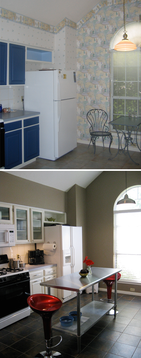
This before photo gives you a better appreciation for the hideous wallpaper, circa 1990. Obviously that came down right away! We found a really affordable brushed nickel pendant to replace the old brass one. The island is just a stainless steel worktable we bought at a local restaurant supply store, but I love the industrial look it added to the kitchen.
The original tile floors were sort of gray and powder blue. When we laid the tile in the entry, we did the kitchen and guest bathroom too. That was a big DIY project, but so worth it when we finished! We only wish we’d done it sooner.
By the way, all the lights, ceiling fans, hardware, and cabinets we removed from our home were donated to the Habitat for Humanity ReStore and we used Freecycle to find new homes for leftover building materials like bricks, tile, and lumber so they wouldn’t end up in a landfill. We feel strongly about recycling everything we can, especially when the City of Austin makes it so easy!
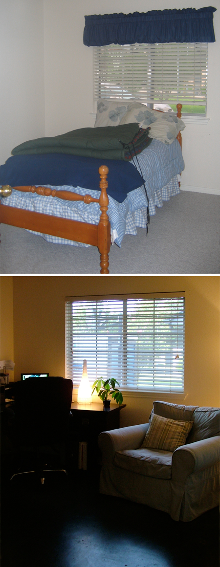
We turned this small bedroom into our home office. You can see we did stained concrete floors in here too. The most extensive change in this room (documented in a previous blog post) actually occurred in the closet, which became my mini office.
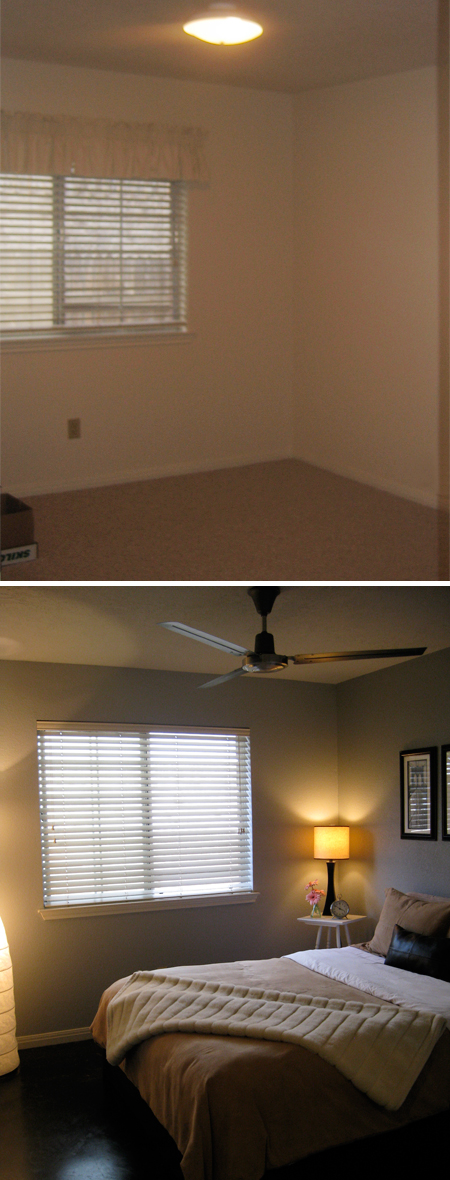
Stained concrete floors, fresh paint, and an industrial-looking ceiling fan complete the transformation in our tiny but inviting guest room.
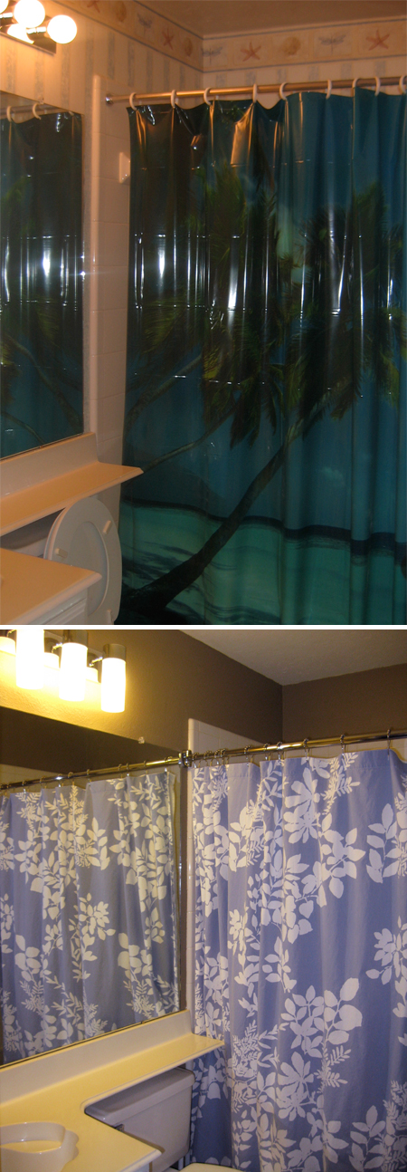
I know what you’re thinking. “It really doesn’t get much classier than that beach-y shower curtain. Why on earth would she possibly take it down?!” Well, sadly, the previous owner took it with him when he moved which totally compromised the whole beach theme that was going on in there. So, I was essentially forced to go in a different design direction.
I think we removed 3 layers of wallpaper in the guest bathroom by the time it was all said and done. We found a modern vanity light to replace the Hollywood one, did a little painting, and installed a crescent rod to make more elbow room in the small shower.
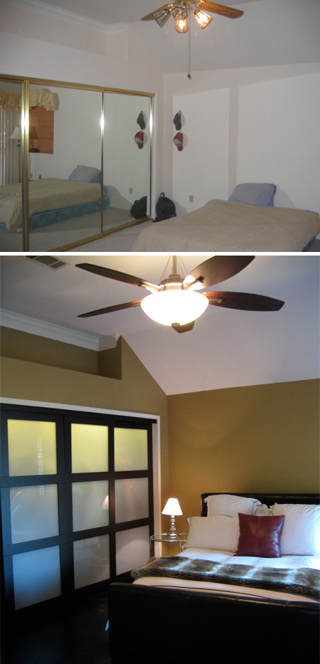
The master bedroom posed another challenging design dilemma because mirrored sliding closet doors (trimmed in brass, no less!) comprised one entire wall. Fancy! We took them down and ended up selling them in our garage sale (to a neighbor who had the same closet doors in his bedroom and wanted a matching set for the opposite wall…I bet his wife was just thrilled when he brought them home!). The room took on a much different vibe as soon as these gems were replaced with contemporary sliding doors and the walls were painted a rich honey-brown color (Sand 5 in the Laura Ashley collection by Valspar).
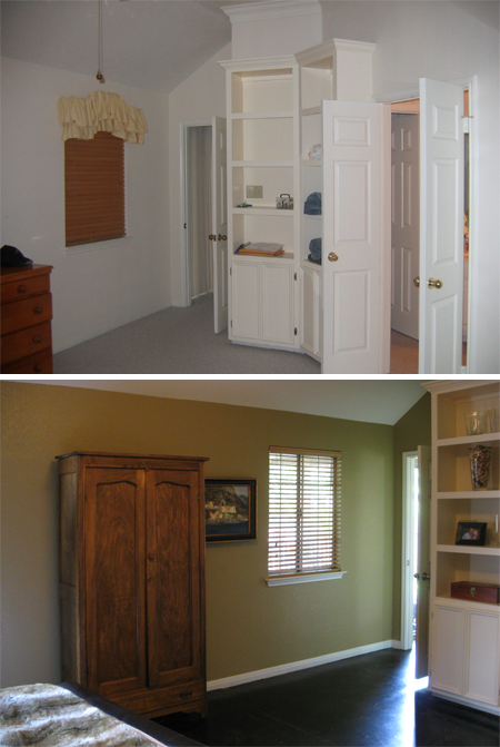
Here’s another view of the master bedroom, standing at the closet looking back toward the door to the living room. To the left of the armoire are a set of doors that open onto the covered patio.
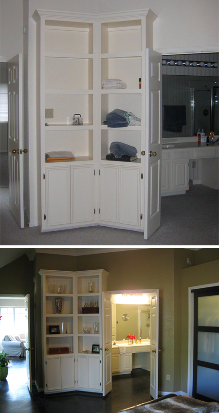
A previous owner custom made the built-in bookshelves, so that was one nice feature we inherited with the house. The double doors to the right separate the bedroom from the master bath.
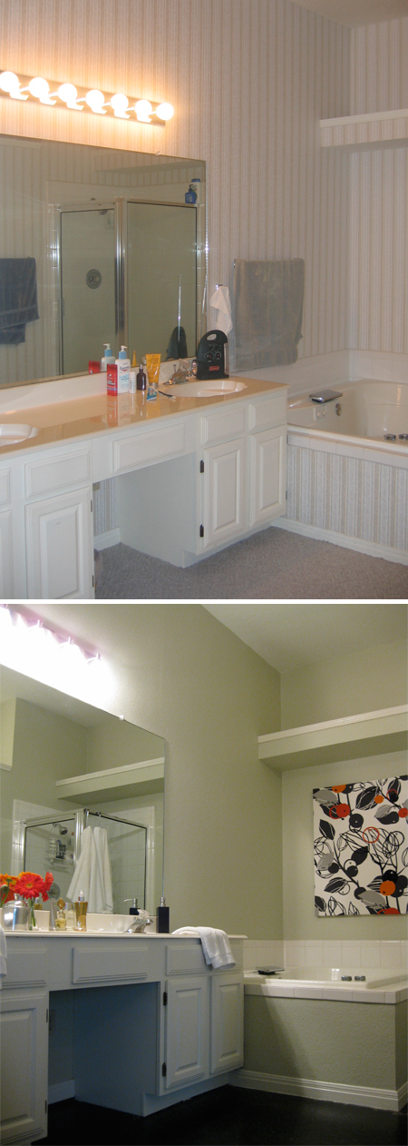
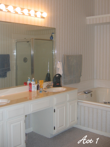
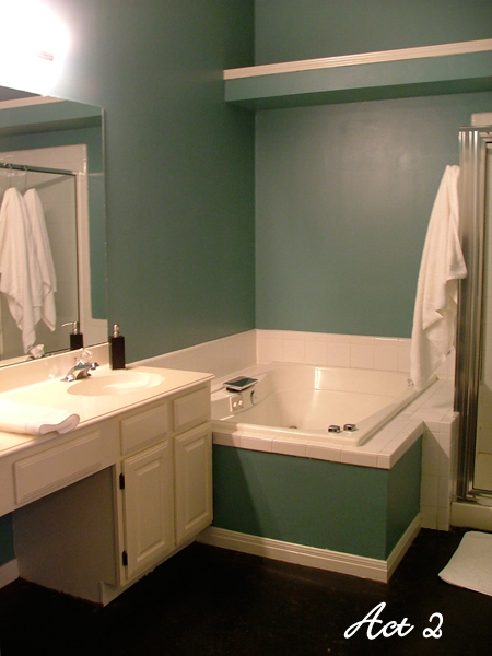
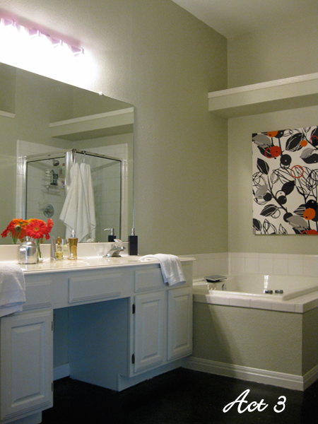
In a previous blog post, I wrote all about our original master bathroom makeover and then how we later staged the space before we put our home on the market.
After we removed the wallpaper, we initially painted the walls teal in an effort to create a peaceful, spa-like retreat. Personally, we loved the color but knew we needed to take it down a notch in order to appeal to potential homebuyers, so we redecorated the bathroom in a neutral color scheme right before we listed the house for sale.
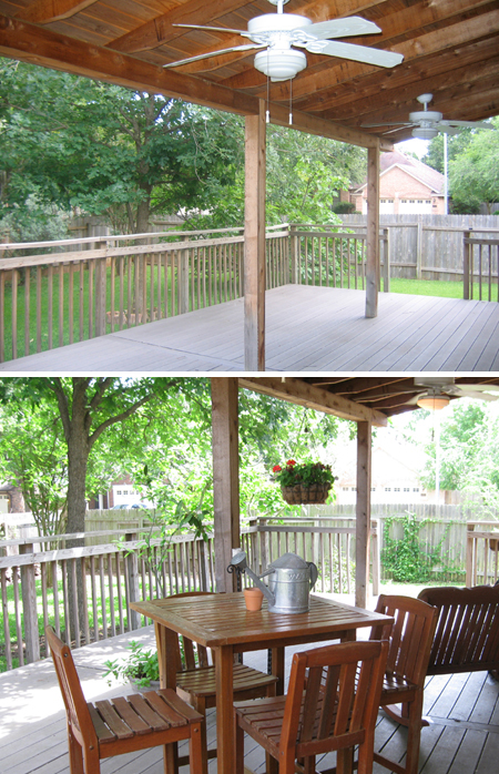
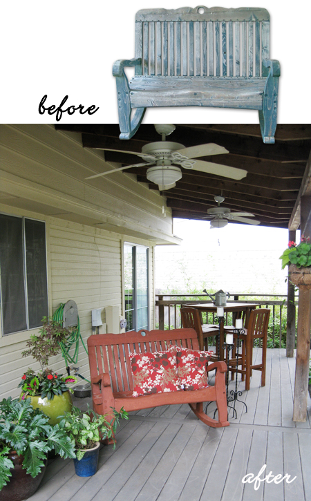
In all honesty, the backyard was the real reason we bought this house in the first place! It had a great covered deck and lots room for Denver to run around like a wild banshee. In the spring and summer we spent most of our free time outside working in the yard, playing with Denver, and eating meals alfresco on the patio. Over time we added more and more native and tropical plants to the landscaping, and a couple years ago we even planted a small organic herb and vegetable garden in the backyard.
This house was our oasis and, needless to say, when it came time to sell our beloved “Chaz Schraz” it was difficult to leave it all behind. But, when we look back, we’re reminded of all we accomplished there. I just hope the new owner loves that little house as much as we did.



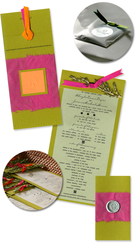














 I centered the conference’s visual identity around a fresh, contemporary
