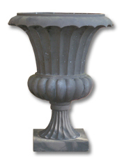
 Meet one of the most versatile objects I own….the trusty garden urn. It made its debut as decor in my wedding almost 5 years ago and has served multiple uses around the house ever since. In the spring and summer it greets guests with colorful flowers on the front porch. When the weather turns cold, the urn finds shelter indoors holding our Christmas tree. I’ve even filled it with ice to keep beverages cool at backyard barbecues. The possibilities are endless!
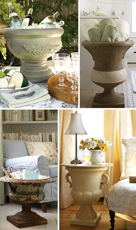 These are some of my favorite ideas from Elle Decor. Urns can make fabulous organizational tools, too. My mom keeps one in her craft room to wrangle big bolts of fabric and rolls of wrapping paper.
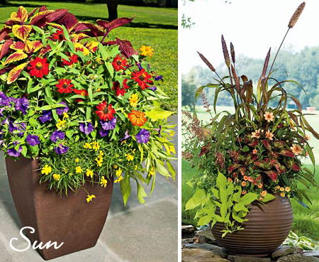
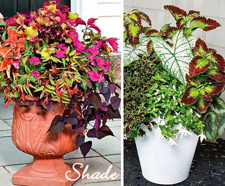
This week I hauled the ol’ urn out to the front porch again but was unsure about what plants to use until I came across this article in last month’s Southern Living. It describes the three elements needed to create interesting planters:
- Thrillers– something tall and dramatic
- Spillers– something to trail over the sides
- Fillers– something to add color
I found the following gorgeous examples of container gardens that employ these principles online at White Flower Farm to serve as inspiration.


So, with plant list in hand I marched off to the local nursery and came home with Dracaena Spikes and Caladiums for “thriller”, English Ivy for “spiller” and Impatiens and Coleus for “filler” — all vegetation that seems to grow well in shade to part sun in our hardiness zone.
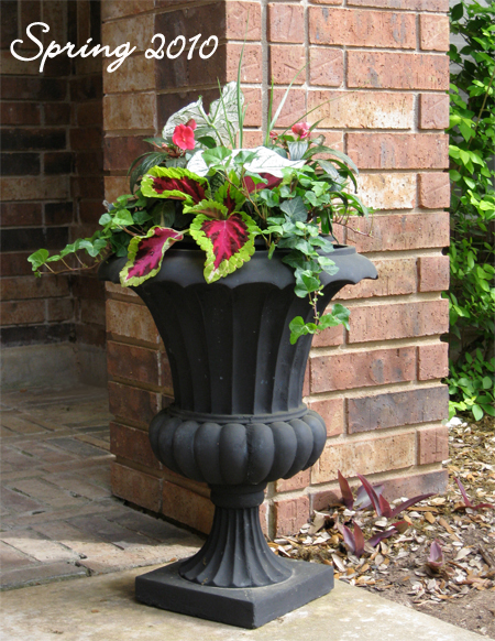 What do you think of the result? Personally, I feel it could use more “thriller”.
I always have such high hopes for gardening in April, but sometime around the first week of June my enthusiasm begins to fade as the temperature rises. We’ll see how long these plants survive this year. The good news is I can always find another use for this handy urn as soon as my green thumb goes south.
- Published:
- April 10, 2010 – 10:35 am
- Author:
- By Shayla
- Categories:
-
- Comments:
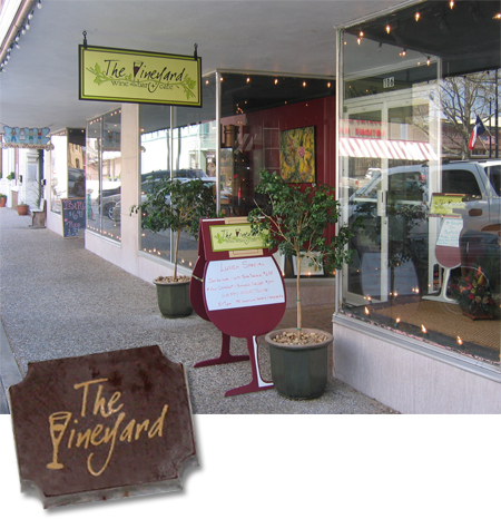
A while back I had the pleasure of developing the brand identity for a cute wine bar and cafe in Brenham, one of my very favorite small towns in Texas. To top things off, The Vineyard occupied a historic building on the downtown square right across from the 1939 Moderne-style Washington County Courthouse. It was truly a dream job because I got to put my architecture and graphic design expertise to work for this locally-owned business.
 A few months after I designed the logo and signage for The Vineyard, I returned to Brenham to help several other small business owners with merchandising their display windows and, while visiting the square, I got to pop in to enjoy the “fruits” of my labor.

They served these adorable little chocolates with each glass of wine that had their logo on them. It was a strange feeling to eat my own design work, but I would happily do it again.
- Published:
- April 3, 2010 – 12:12 pm
- Author:
- By Shayla
- Categories:
-
- Comments:
Just popping in to say hello! This little munchkin is the reason the bloggy has been quiet this week…..

We just returned from Tulsa where we got in some good cuddle time with our niece. Nealy is 3.5 months old now and her newest tricks are holding her head up and giggling. Words can’t express the sweetness! Just look at those blue eyes.
I’ll be back soon with our regularly scheduled programming…..
- Published:
- March 30, 2010 – 7:28 am
- Author:
- By Shayla
- Categories:
-
- Comments:
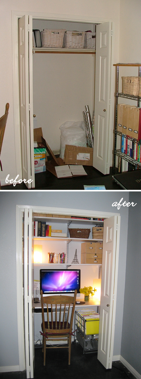
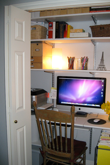
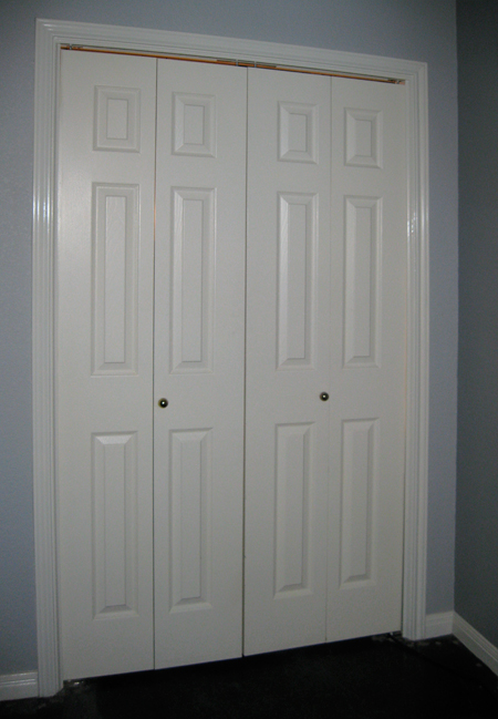
Welcome to the international headquarters of design finch, Inc! I thought I’d show you were all the magic happens, but in order to truly appreciate the space you need to see the complete transformation. While I enjoy sharing an office with my hubby, our previous workspace was really cramped, inefficient and lacked storage for books and supplies. The office has a decent-sized closet, but without adequate shelving it was mostly wasted space. This is what the closet looked like shortly after we moved in…..

…..and this is what it looks like today! We removed the existing shelf and clothes bar, painted the interior of the closet gray, then installed white and platinum Elfa shelving from the Container Store. Since the shelving goes all the way to the ceiling, there is plenty of room to store my books, design magazines, paper samples, etc. I lovingly call it my “Cloffice” (closet + office).

The shelving on the left houses my all-in-one printer/scanner/copier/fax, along with office supplies. Rolls of wrapping paper are tucked way in the back, yet still easily accessible.

The best part of all is that I can close the doors when I’m done working and just walk away.
- Published:
- March 21, 2010 – 8:07 pm
- Author:
- By Shayla
- Categories:
-
- Comments:
I’ve had a lot on my plate lately and this week was particularly hectic. Between full-time and freelance work, multiple project deadlines, volunteer commitments and meetings, I haven’t had much down time. After a long day it’s so easy to neglect the home front, especially cooking nutritious meals for the two of us. The most difficult part of getting dinner on  the table is deciding what to make, and the easiest way I’ve found to answer the dreaded “what’s for dinner” question is to map out a menu for the entire week in advance. Without a plan, I’m more tempted to make poor choices, which usually results in a trip through the Taco Bueno drive thru. (Muchaco, anyone?!)
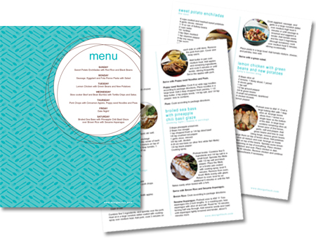
On Sundays, while cleaning out the fridge, I’ll take stock of items that need to be used and try to come up with meals for the week incorporating those ingredients. In addition to planning around what’s already on hand, I also make sure there is some nutritional variety mixed in, otherwise we’d happily eat pasta for every meal! My favorite resource for finding consistently yummy and healthy ideas is myrecipes, which archives recipes from magazines such as Cooking Light, Southern Living, Real Simple and Health. Once the menu for the week is determined, I post it on the fridge along with the recipes. Since there is no guesswork involved, hubby often has dinner started before I even get home. He is an amazing cook and I’m very thankful for all his help.

Download my Menu of the Week
Sunday: Sweet Potato Enchiladas with Red Rice and Black Beans
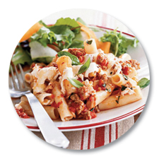
Monday: Sausage, Eggplant and Feta Penne Pasta with Salad
Tuesday: Lemon Chicken with Green Beans and New Potatoes
Wednesday: Slow Cooker Beef and Bean Burritos with Tortilla Chips and Salsa
Thursday: Pork Chops with Cinnamon Apples, Poppyseed Noodles and Peas
Friday: Date Night!
Saturday: Broiled Sea Bass with Pineapple Chili Basil Glaze over Brown Rice with Sesame Asparagus
(We usually eat the leftovers for lunch the following day.)
My pre-planned menu was really a lifesaver this week. What are some of your go to recipes for pulling dinner together quickly on a crazy weeknight?
- Published:
- March 13, 2010 – 2:01 am
- Author:
- By Shayla
- Categories:
-
- Comments:
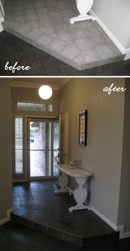
Let me begin by saying I have nothing against gray. It’s quite a lovely color. I’m a big fan, in fact. But the gray tile in our entry area was just not working for me. It was as if you were greeted by 1989 upon entering the front door. We’ve actually intended to replace it since the day we purchased our home almost 4 years ago, but other projects have taken precedence. If you’re a homeowner, you know how that goes.
 Over the past few months we visited a long list of flooring stores and felt generally disgusted by all the horrendous choices out there. Fortunately, we found a handful of options we liked well enough to bring home samples and then narrowed them down to our top two favorites. Ultimately, we chose Marazzi’s Imperial Slate in black which is actually a glazed ceramic tile that closely resembles natural stone.
 We were dreading pulling up the old tile, but it turned out to be a great stress release. Measuring, cutting and laying the new tile was another story! I was really wishing I’d paid more attention in high school geometry class; it finally would have come in useful. Thankfully we don’t lay tile for a living because it was back-breaking work! The finished product was so worth it, though. Check it out:

Now that the dust has settled (literally), I’m really pleased with the results. The color of the tile blends well with the adjacent black stained concrete floors, which unifies the space and makes it appear larger. I think the darker color makes the entry area feel more grounded, too. So, goodbye gray! The new tile is here to stay.
- Published:
- March 6, 2010 – 10:42 am
- Author:
- By Shayla
- Categories:
-
- Comments:
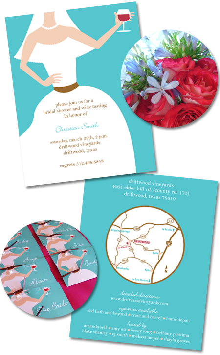
I know it’s still February, but I’m already in spring cleaning mode. While organizing files on my computer, I came across an invitation I designed this time last year for my sweet friend Christian’s bridal shower which was held at a vineyard in Driftwood, Texas. Of course there was wine tasting involved, so I didn’t have to search far for inspiration!

I created the illustration of the bride holding a wine glass and carried it across the invitations and nametags to emphasize the theme. If you look closely at the nametags, you can see where I tied a thin, brown ribbon to embellish the bride’s sash. It’s all about the details, people!
Hopefully another occasion for celebration rolls around soon. I love designing invitations, especially for a dear friend.
- Published:
- February 27, 2010 – 9:48 am
- Author:
- By Shayla
- Categories:
-
- Comments:
 This week our sorority alumnae group hosted a great event called “Love Yourself”. One of our members is a wardrobe consultant and she opened her showroom to the Delta Gammas and shared fashion tips for every body type. It was fun to catch a glimpse of the spring trends and color palettes, although Miranda warned us not to jump on every fashion bandwagon just because it’s the latest thing. Know thyself! Embrace the body you have NOW and only buy items that fit, flatter and function well.
We were encouraged to choose a fashion icon, ideally someone who shares your body type and whose sense of style you really relate to. You can learn a lot just by observing what that person wears and noting why it works for them. Great tip, right!

My fashion icon is most definitely Jackie Kennedy. I think she is the definition of grace and I really admire the classic simplicity of her style.

Studying her wardrobe closer, I was able to pick out the design elements that most appeal to me:
- Tailored lines emphasize her great silhouette.
- Bateau necklines are conservative, yet feminine.
- Monochromatic palettes keep it simple.
- Signature accessories (over-sized sunglasses and pearl necklace) add sophistication.
- Less is more.

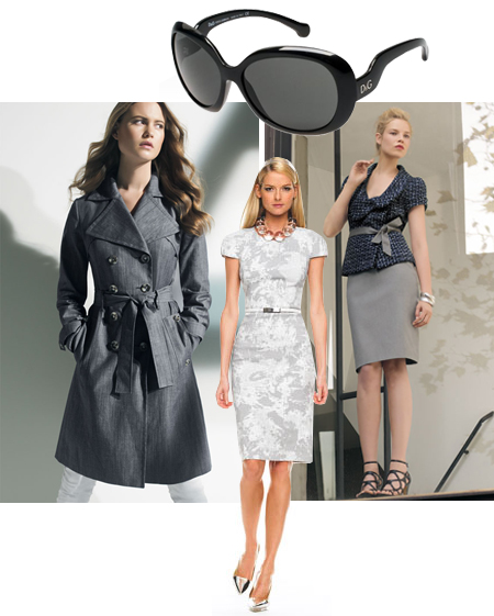
Clockwise from top: D&G Sunglasses, Classiques Entier Tweed Jacket,
Michael Kors Belted Sheath Dress, Calvin Klein Belted Trench
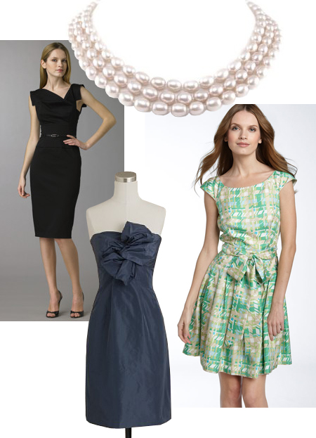
With those themes in mind, I channeled my inner Jackie O and went in search of pieces I would love to add to my own wardrobe. None of these things are actually in my price range, mind you! But now that I know what to look for, I can bargain shop with a purpose.

Clockwise from top: Freshwater Pearl Necklace, kate spade Joelynn Dress,
J. Crew Silk Taffeta Bow Monde Dress, Black Halo Jackie O Dress
Do you have a fashion icon? If so, who is it and what do you most admire about their style?
- Published:
- February 20, 2010 – 1:27 am
- Author:
- By Shayla
- Categories:
-
- Comments:
 This little sweetie has captured our hearts! Our niece Nealy Brooke arrived on the scene in December and we are absolutely smitten with the newest addition to the family. While I’m slightly biased, there’s no arguing she’s ridiculously precious. She has that “fresh from heaven” smell, too. I could just eat her up!

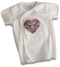
Nealy’s favorite aunt thought she needed a festive little outfit to wear on her first Valentine’s Day, so I made this sweet side-snap tee for the special occasion. Of course, when I say “made” I mean bought it at the store and just sewed some fabric on. Bless your heart if you thought I actually made the tee too!

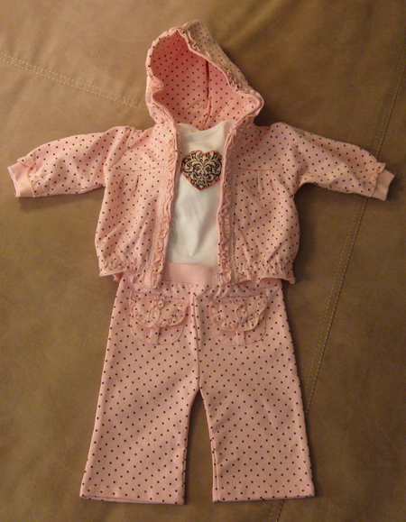
Here’s the whole ensemble. I purchased the pink and brown polka-dotted sweatsuit first and then searched for complementary fabric to use for the heart. I figure it’s only a matter of time before I become the crazy aunt who sends coordinating outfits for every holiday.
At least she’ll never have to worry about receiving knitted sweaters.
- Published:
- February 12, 2010 – 8:00 am
- Author:
- By Shayla
- Categories:
-
- Comments:
It’s February and love is in the air! In my house that means it’s time to break out the construction paper and doilies. We have a rule that store-bought cards and fancy gifts are not allowed on Valentine’s Day. Instead, our tradition includes exchanging homemade valentines and baking heart-shaped pizzas together.
It’s the stuff romance novels are made of.

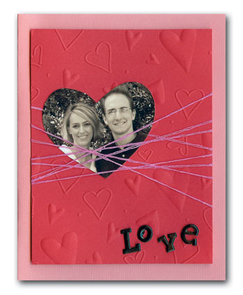
This is one of the many cards I’ve made for my sweetie over the past 12 years. It was inspired by some hot pink string I already had on hand. If you’d like to whip one up for your Valentine, these are the supplies you will need:
- Heavy-weight paper folded into a card (or purchase some pre-made blank cards)
- Decorative or textured card stock for the background (mine was embossed with hearts)
- String or embroidery floss in a pretty color
- A photograph cut into a heart shape
- Stickers or scrapbooking letters (mine were the brad kind)
- Double-sided tape
Follow these easy steps to create your own version of my “Heartstrings” card:
- Cut the decorative paper slightly smaller than your card.
- Wrap the string around the decorative card stock, securing the string with double-sided tape on the back side.
- Slip your photo between the strings and secure the back with double-sided tape.
- Attach stickers or scrapbooking letters to spell out your message.
- Adhere the decorative card stock to the actual card.
- Finally, write an ooey-gooey note inside.
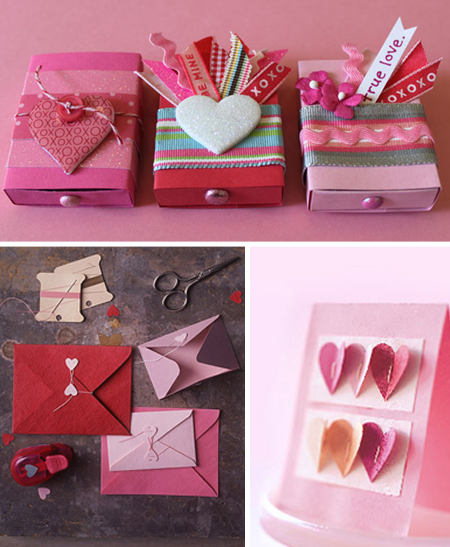
Now that you’re feeling really inspired, here are some other crafty Valentine’s Day ideas from around the interweb.
 Top: Rachel Johnson’s Matchbox Valentines, Bottom: Martha Stewart’s
Heart Seals and Hand-stitched Valentine
Leave it to Martha to come up with some adorable cards. Visit her card-making center for more eye-candy! You’ll come away wanting to hug her and strangle her at the same time (or maybe that’s just me?).
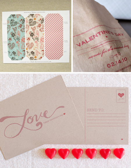
 Clockwise from top: Natalie Jost’s Printable Cardvelopes, Twig & Thistle’s
DIY Brownie Bags, The Wedding Chicks’ Printable Postcard
If you’re running short on time or just can’t muster the creativity to make your own, the talented designers above have already done the work for you. Visit the links to download free templates for these projects. All you need is a printer and some paper.
 Left: Living Locurto’s Valentine Bookmarks, Right: Simply Handmade’s
Printable Valentines
How cute are these for kids? Skip the cheesy ones at the grocery store and download these clever cards for FREE right here.
Now you have absolutely no excuse for avoiding Cupid this year!

- Published:
- February 6, 2010 – 12:58 pm
- Author:
- By Shayla
- Categories:
-
- Comments:
 Meet one of the most versatile objects I own….the trusty garden urn. It made its debut as decor in my wedding almost 5 years ago and has served multiple uses around the house ever since. In the spring and summer it greets guests with colorful flowers on the front porch. When the weather turns cold, the urn finds shelter indoors holding our Christmas tree. I’ve even filled it with ice to keep beverages cool at backyard barbecues. The possibilities are endless!
 These are some of my favorite ideas from Elle Decor. Urns can make fabulous organizational tools, too. My mom keeps one in her craft room to wrangle big bolts of fabric and rolls of wrapping paper.
 What do you think of the result? Personally, I feel it could use more “thriller”.